
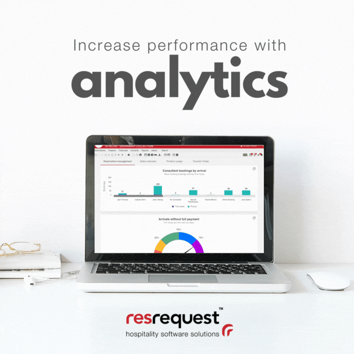
A chart could be worth a hundred more bed nights.
If your job requires that you stay on top of information, you have probably mastered working with ResRequest’s reports which show data grouped in tables and worksheets.
A shift to working with that data on charts can highlight trends and patterns quickly and clearly, so you can make better decisions for your business.
Charts have many benefits. They can:
- Summarise large amounts of data in a clear way.
- Help you grasp the meaning of data quickly.
- Draw conclusions, especially if the same chart is used consistently.
We regularly add new charts to ResRequest to make it easy to see data patterns. In this Email Series, we focus on dashboards and charts available in ResRequest. Our aim is to help you interpret your data in the available charts for better business decision-making.
How can I break through data intimidation?
As bookings are converted, operational processes are implemented, and customers are accommodated and entertained, we start analysing and measuring our success. This measuring can make the difference between profit and loss, winning and losing.
Having access to vast amounts of data is a huge opportunity. But the more data you have the more difficult it can be to see the patterns and the information that leads to better decision-making. There is just so much data, and it needs interpretation to provide value.
So how can you leverage all of the amazing and abundant charts in ResRequest to empower and improve your workflows and results, instead of overwhelming them?
Here are a few tips to help you bravely work with the charts available to you:
- You don’t need to be an actuary to work with charts. You capture the data, and the charts simply collate the detail and show that detail in a way that helps determine actions to take in your business.
- Look for the low-hanging fruit. Don’t try to deal with everything the data is telling you. Sometimes just one of two small observations from the data analytics can result in major shifts for an SME.
- Repeat. Repeat. Repeat. Incorporate the same charts into your reports, meetings, and daily operations. This will help your team become more familiar with them resulting in them spotting patterns, and adjusting their inputs accordingly
Reservation Management
Look close-up at your sales team’s performance and processes
Our suite of dashboards covers several key performance areas including reservations, sales, and industry trends. In this email, we will focus on the Reservation Dashboards.
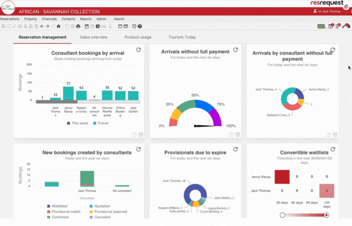
The Reservation Management Dashboard shows your sales team’s performance and highlights opportunities and possible risks. Here is a closer look at these graphs.
Use the Consultant bookings by arrival to see consultant workloads based on bookings due to arrive during the current week or beyond. This report identifies potential workload imbalances or risks when specific consultants take leave.
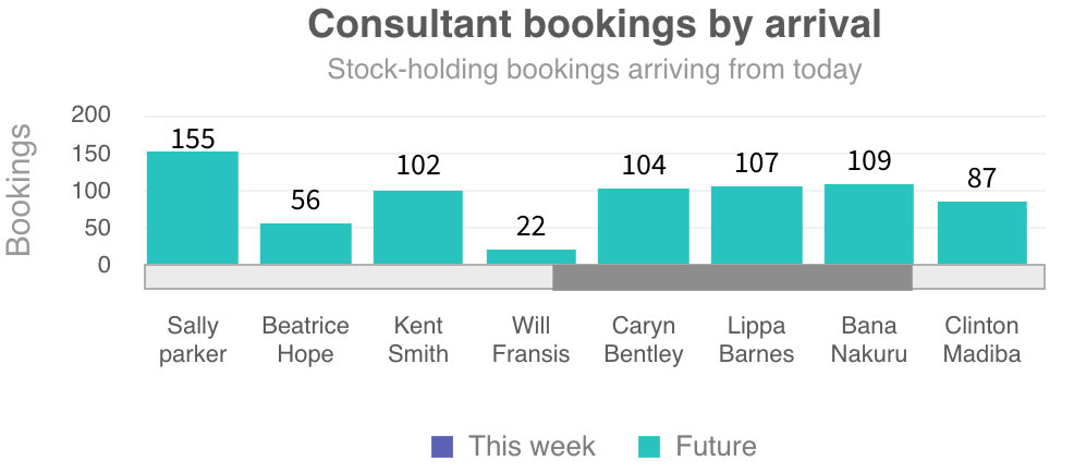

This chart shows the total number of bookings each sales consultant has made this week which is helpful to understand workloads and performance. We especially love how this chart can be changed dynamically to quickly show top conversion performers.
How can I use these charts?
These charts are available in your ResRequest Dashboards. Extend a user’s User Access to include these charts then find them in the ResRequest Dashboards menu.

I love charts, how can I access more?
- Working with our integration partner product, ResInsite will unlock custom and pre-determined charts for your team. This analytics tool is developed by Business Analytics specialists, Travel Trackers.
- Speak to our Professional Service team about our Business Intelligence Package.
- Look out for next week’s episode when we will cover more graphs.
If you would like to learn more about our Reservation Management Dashboards, Contact us.
